

Minimalism gets sold as an aesthetic and practised as an excuse. Strip a page back far enough and it stops being restrained; it becomes vague. The useful version is harder and less photogenic: every element on the page has to earn the space it occupies, and the ones that cannot are removed rather than shrunk.
Key takeaways
- 01Restraint is a series of decisions, not the absence of them.
- 02Remove elements that do not earn their space; do not simply shrink them.
- 03Whitespace is a hierarchy tool before it is a style.
- 04If a page needs an explanation to be understood, the layout has not finished.
Restraint is a decision, not a default
The instinct when a layout feels cluttered is to reduce everything a little — smaller type, thinner rules, paler greys. The page gets quieter without getting clearer, because the underlying problem was never the volume. It was that nothing was ranked.
Ranking is the work. Decide what a visitor must read, what they may read, and what exists only because someone in a meeting asked for it. The third category is usually the largest, and deleting it does more for the page than any amount of styling.
- Give the primary message its own space, not just a larger size.
- Let secondary content sit at genuinely secondary weight.
- Cut anything you cannot assign to either group.
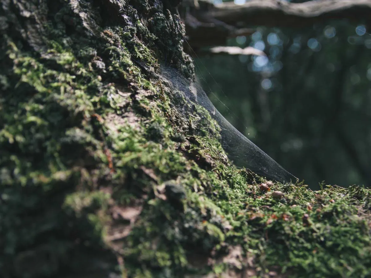
Restraint is the hardest thing to sell and the easiest thing to recognise.
Whitespace is structure, not decoration
Space groups things. Two elements close together read as related whether or not they are, which is why inconsistent spacing quietly confuses people who could not tell you why. Set a spacing scale, use it everywhere, and the hierarchy holds without a single border.
The test is simple: squint at the page until the words blur. If the shapes still tell you what is important, the structure is sound. If they do not, no typeface will save it.
One considered email a month
Notes on design, brand and the work we ship. No filler, no cadence for its own sake.
Unsubscribe any time.
Frequently asked
The questions this piece tends to raise.